
If Boston is a “city of neighborhoods,” their boundaries are neither fixed nor uncontested, let alone waterproof. Or so it appears in Andy Woodruff’s book, “Boston in 50 Maps.”
His configurations and some of their predecessors make for the newest addition to a series of books on urban cartography issued by Belt Publishing, a company founded in 2013 to “promote voices from the Rust Belt.”
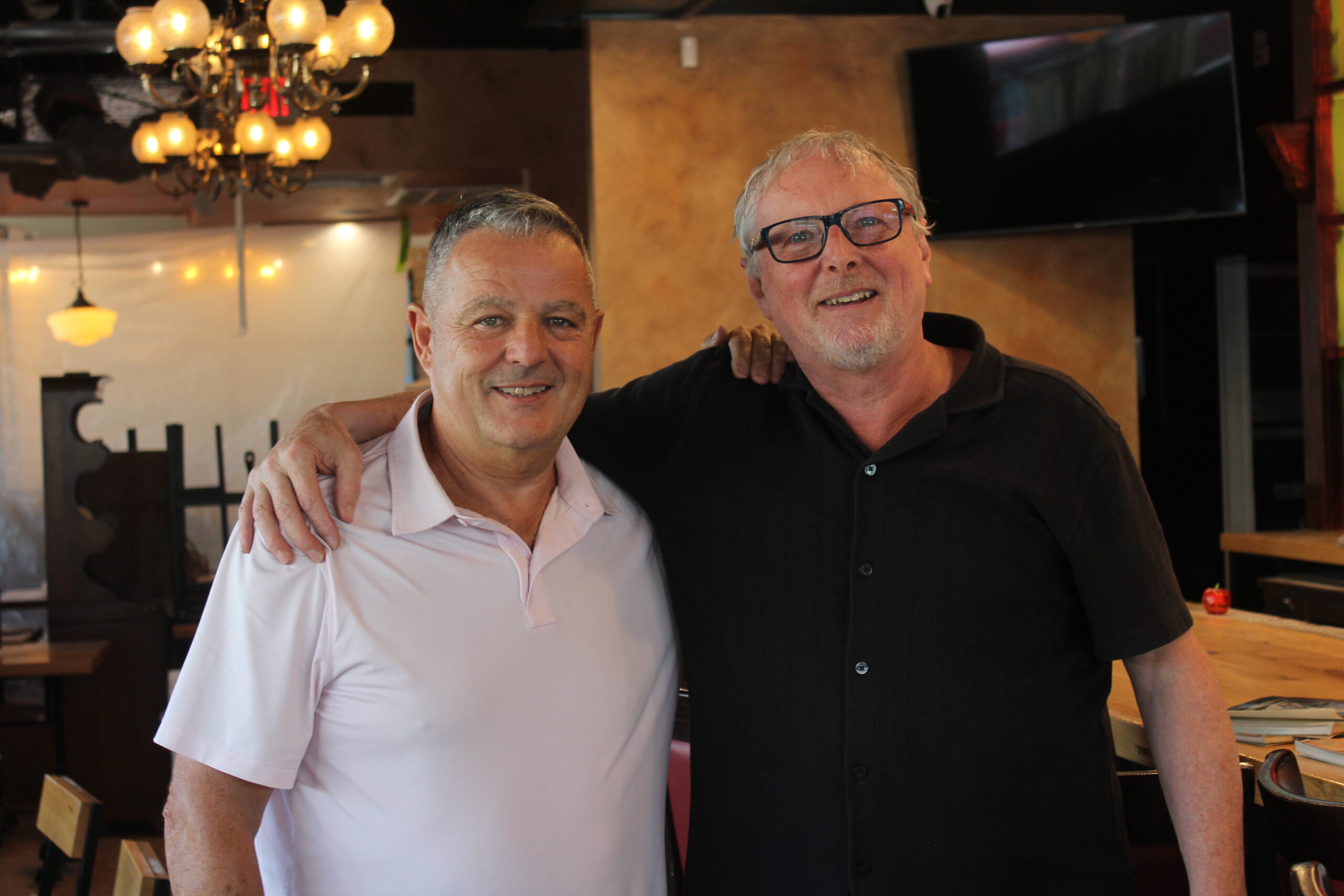
An Ohio native from the Dayton area, currently living in Belmont, Woodruff has Rust Belt pedigree, but also family connections to Greater Boston. As a cartographer, he also has experience navigating between three-dimensional street perspectives and a bird’s eye panoptic.
“I was the kid in the backseat of the car, if we were on a vacation, looking at the road atlas about where we’re going to,” Woodruff recalled in a remote interview. “And so, eventually, I studied geography in college and focused then more narrowly on making maps specifically, and so I’ve just kind of always been a map person.”
With his book, Woodruff qualifies as a curator of maps, though building on an earlier venture as a curator of perceptions. In 2010, he joined with fellow cartographer Tim Wallace to launch the “Bostonography” website, whose “interesting visual representations of life and land” were meant to spark more engagement with the city. “As a showcase of such efforts large and small,” their website suggested, “perhaps Bostonography can do its tiny part to help people better know their city, spur further exploration, instill civic pride, and build a sort of graphical visibility that promotes Boston as a cool city to the rest of the world.”
A highlight of their project was a crowdsourced visualization of Boston’s “tangled” neighborhood boundaries.
Since most of Boston’s territory had been amassed through annexations, mainly in the late 19th and early 20th centuries, formerly independent communities were clearly defined by hard lines on historic maps. More elusive were less formal distinctions, such as those between Dorchester and Mattapan, or Roxbury’s former subsections of West Roxbury, Roslindale, Jamaica Plain, and Mission Hill.

In Woodruff’s book, the visualization of “neighborhood consensus” resembles a heat map, with depths of agreement in large, dark patches, surrounded, more faintly, by shallows of ambiguity. Rather than tightly interlocking slabs of a jigsaw puzzle—a common learning tool for geography—Woodruff presents a gradient, not unlike the one that appeared on the wall behind him in his interview: his own topographic map of a section of the White Mountains.
One inspiration Woodruff cited for his book was “Unmapped Boston,” a 2006 plotting of “Squares, Hills, Neighborhoods and Thoroughfares” by the graphic design professional, Matthew “Max” Harless. On his website, Harless describes his artifact as an “earth-shattering new map of Boston,” in full color and suitable for framing.
At first glance, “Unmapped Boston” might be taken for an urban transit map re-scrambled as a colorful abstraction by Vassily Kandinsky. On closer examination, the map shows something more granular than a “city of neighborhoods.” Several neighborhoods are identified in faint upper-case letters, though without boundary lines. It’s sometimes easier to make out the smaller black letters that designate pinpoints such as Spaulding Square on Neponset Avenue.
Harless identifies another Dorchester pinpoint as “The Affy.” On Google Maps, it shows up as a small patch of green between Mullen Square and Richardson Park near Edward Everett Square. It’s officially identified by a sign at eye level as the Robert A. Meaney Playground and, in a subscript, as Atheneum Park. The alias on the sign associates the park with the former site of the Dorchester Atheneum, celebrated on the Women’s Heritage Trail as one of the gathering places for Dorchester’s anti-slavery activists in the 19th century. This was also the site of Dorchester’s very first meetinghouse, in the 17th century.
In 2006, the same pinpoint served as final shooting location for the first film directed by Ben Affleck, “Gone Baby Gone,” adapted from the 1998 crime novel by Dennis Lehane, who had grown up in the same neighborhood. The only connection between the dots in time is the dot on a map. That goes for other fixed locations in Dorchester: the change from “Calf Pasture,” dump, and prisoner-of-war camp on the Columbia Point Peninsula to a university and presidential library. It even goes for an elderly housing complex near Peabody Square that supplanted what would later become its namesake, the “Englewood” diner.
For the uninformed passerby, the “Affy” itself might be less remarkable than its visual or colloquial pointers to an invisible history. Such was the mental mapping expounded by Marco Polo in “Invisible Cities,” the postmodern novel by Italo Calvino: “The eye sees, not things, but figures of things that signify other things.” Polo’s city is made, not of materials and definite shapes, but the “relations between the dimensions of its space and happenings of its past.”
In his 1951 memoir, “A Walker in the City,” Alfred Kazin described how, in treks between his Brooklyn neighborhood and the “city” in Manhattan, geography could cross the line into history. Fascinated by old buildings that seemingly “gripped to themselves some texture of the city’s past,” Kazin rejoiced that “walking could take me back into the America of the nineteenth century.”
As a transplant to the Boston area, Woodruff made his own treks, walking the streets, observing, and sometimes taking photographs. “So it was just kind of exploratory,” he said. “I just wanted to always get out and check out a neighborhood I hadn’t seen before, just kind of walk through and see what’s there and what I hear and see and, bit by bit, kind of learn about the place I had moved to.”
As reflected in some of Woodruff’s maps, Boston is a scatter of particles, with colored dots marking anything from building types to Dunkin’ locations or sightings of turkeys. In one map, his streetwise observations also registered what often escapes notice about the way pinpoints function as places: the unshapely configurations of Boston’s squares. Rather than tidy quadrilaterals, Woodruff’s outlines of street patterns add up to a miscellany of angular snarls, less like crossroads than cross-purposes.
Some of Woodruff’s maps show what’s hardly surprising, as in the higher concentration of the city’s work sites and population closer to downtown. The distribution of Dunkin’ locations is arranged in colors and textures to measure proximity by vehicle or foot. If a single Dunkin’ hardly amounts to a landmark, the multiplicity and uneven concentrations say something else. Judging by the maps, it’s possible to correlate Dunkin’ density and work sites, or even rate parts of Roxbury and Dorchester as Dunkin’ deserts.
Also concentrated closer to downtown are restaurants with liquor licenses, mapped as a cluster of orange dots contrasted with the blue dots for have-not establishments more prevalent in the rest of the city. Woodruff acknowledged the well-known connection between the locations and the price gradient for a restricted supply of licenses—as well as more recent attempts to address the imbalance.

To illustrate disparities in access to mortgages, commonly known as “redlining,” Woodruff goes back to another map series, produced for the federal government in 1930 by the Homeowners Loan Corporation (HOLC). Its Boston map shows “hazardous” grades for the South End and Roxbury, the areas with most of Boston’s small Black population, but also for areas that would be later targeted for urban renewal, such as the West End, the “New York Streets” neighborhood of the South End, and the Barry’s Corner section of Allston. Also declared “hazardous” were a part of Dorchester between Savin Hill and Neponset Circle, the “Lower End” of South Boston, and a strip of Jamaica Plain near the elevated transit line that would be removed in 1987.
The HOLC map showed a few pockets of “still desirable,” including parts of the Back Bay and West Roxbury. But much of the city, from Roxbury and Dorchester to Roslindale and Hyde Park, was rated as “definitely declining.” Though the HOLC did not explicitly designate racial groups, it downgraded for populations that were profiled as “shifting” or “cosmopolitan.”
Woodruff overlaid the HOLC map with areas of higher and lower income from 2022, but the grades of risk can also be correlated with another map that shows the distribution of three-decker houses. Woodruff plots them as orange dots, like an outbreak of freckles, chiefly bunched up in Dorchester and Mattapan, but also in a part of East Boston labeled in 1930 as “hazardous.”
It’s not too far a stretch from the 1930 risk profiles to a notion of the city in Walter Muir Whitehill and Lawrence W. Kennedy’s classic “Boston: A Topographical History.” In his 1968 preface, Whitehill characterized much of the territory absorbed through annexation as formerly rural but “submerged in inelegant urban sprawl.” He observed, “Such centrifugal expansion of population led to the extension of city boundaries far beyond the limits of the Boston peninsula, and to many of the problems of the city today.”
Their book also suggests that the peninsula’s original limits, with a tenuous link to the mainland, might not have been exclusively topographical. Though Boston would gradually expand and create new connections to other places, Whitehill and Kennedy note that it would take more than a century to significantly outgrow the original configuration, enough time to solidify Boston’s character of “a tight little island.”
In its first graphic after the introduction, Woodruff’s book shows Boston’s 1630 peninsula with a color-coded overlay of additions up to 1880 and after. In areas near downtown, including the Back Bay, as well as South Bay, it’s clear that much of the newer land had been ocean or wetlands. Where a series of maps suggests encroachments of land, Muir Whitehill looked even farther back and saw the opposite, picturing the shores of New England as a “line of submergence” with deep roots in geological history.
According to the Nancy Seasholes book, “Gaining Ground: A History of Landmaking in Boston” (2003), Dorchester’s entire shoreline consists of made land, including enlargements of Columbia Point Peninsula and Commercial Point, as well as Victory Road Park, which originated as an illegal fill. At the beginning of the century, the currently landlocked Clam Point area was still flanked by two bodies of water — “Barque Warwick Cove” and Tenean Creek. Even as recently as the 2020, new features would be added to reduce the vulnerability to flooding at the Garvey Playground in Neponset.

A flooded-out Morrissey Blvd. in 2018. File photo
In 2018, former mayor Marty Walsh responded to rising sea levels by announcing a “Resilient Boston Harbor” plan that was extended from earlier plans for Charlestown and East Boston. Among the recommendations for Dorchester were steps to remedy the increasingly frequent flooding from high tides on Morrisey Boulevard, a road passing over what had once been mainly water or wetlands.
Woodruff highlights the ongoing sea change in a pair of maps comparing Boston’s flood risk zones, the actual for 2020 with the projected for 2070. In the later map, a one-hundred-year storm could potentially reconfigure Boston as something like its 17th century contours, except that the original peninsula would be reduced to an island.
Some of Woodruff’s maps qualify as static visualizations of something fluid, whether in space or time. That explicitly applies to one of his maps of downtown Boston, overlaying the present land mass and the 1630 shoreline. The graphic also floods the tangle of streets with a swarm of arrows to show how 17th century traffic would flow purposefully toward the city’s port activity, near the current site of Faneuil Hall and Dock Square. Unlike the contemporary nightmare of congestion or the legendary imprint of cow paths, the map conveys a look of intelligent design.
“Years and years ago,” Woodruff reflected, “when I gave a few minutes thought to pursuing an academic geography or cartography career, something I was really interested in was when and how do maps determine the reality — versus the other way around, where a lot of times we think of maps as neutral representations of the world, and there’s really no such thing. And sometimes that goes so far as to shape the world: the map shapes the world itself.”
Like Whitehill and Kennedy, Woodruff traces back to an underlying feature of Boston that long predated the arrival of the first European settlers: the remains of fish weirs made by indigenous people that were unearthed in 1913 during subway construction under Boylston Street. As the earlier book explains, the wooden infrastructure could only have been useful when sea levels were low enough for the fish hauled in with the tide to be winnowed and harvested.
A remnant of an extensive network through the Back Bay’s tidal flats and salt marshes, the fish weirs, according to a display at the Leventhal Map Center in the Boston Public Library in Copley Square, were “an ecological engineering feat that formed the basis for a thriving economic and cultural system.” In the eye of a cartographer, that could take the form of a fixed boundary adapted to a state of flux, conceivably by people who found their way to consensus.
“They might not have been drawing the map,” Woodruff surmised, “but it was knowledge that was in people’s heads of what was where and what it was useful for. I’m sure people had mental maps, if they didn’t have real maps.”
